Can We Finish That for You? Tile Insights from BrightBuilt Interiors
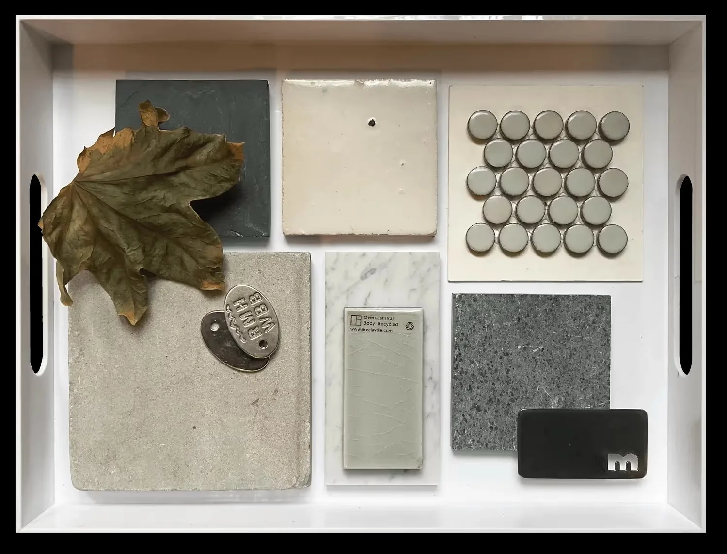
An example finishes palette curated by our Interior Design Department
When designing the interior of a new home, selecting tile plays a key role in the functionality and overall feel of the space. Here are a few things to consider and tips from our interior designer to help you navigate these tiles and tribulations (okay, okay, no more puns from us).
Whether it be shower walls, a kitchen backsplash, a mudroom entryway, or a decorative detail, tile is a great way to add color, texture, and depth to your home. Here are some tips to consider:
Determine a color palette.
Color theory can be overwhelming (there are entire classes devoted to it in design school!), so the help of an interior designer can be essential in this area. Some things to keep in mind: palettes can be complementary, monochromatic, triadic, etc and we recommend sticking with 2-4 colors. Consider that colors elicit feeling, so pay attention to how the tile options and materials make you feel when you are looking at samples and examples.
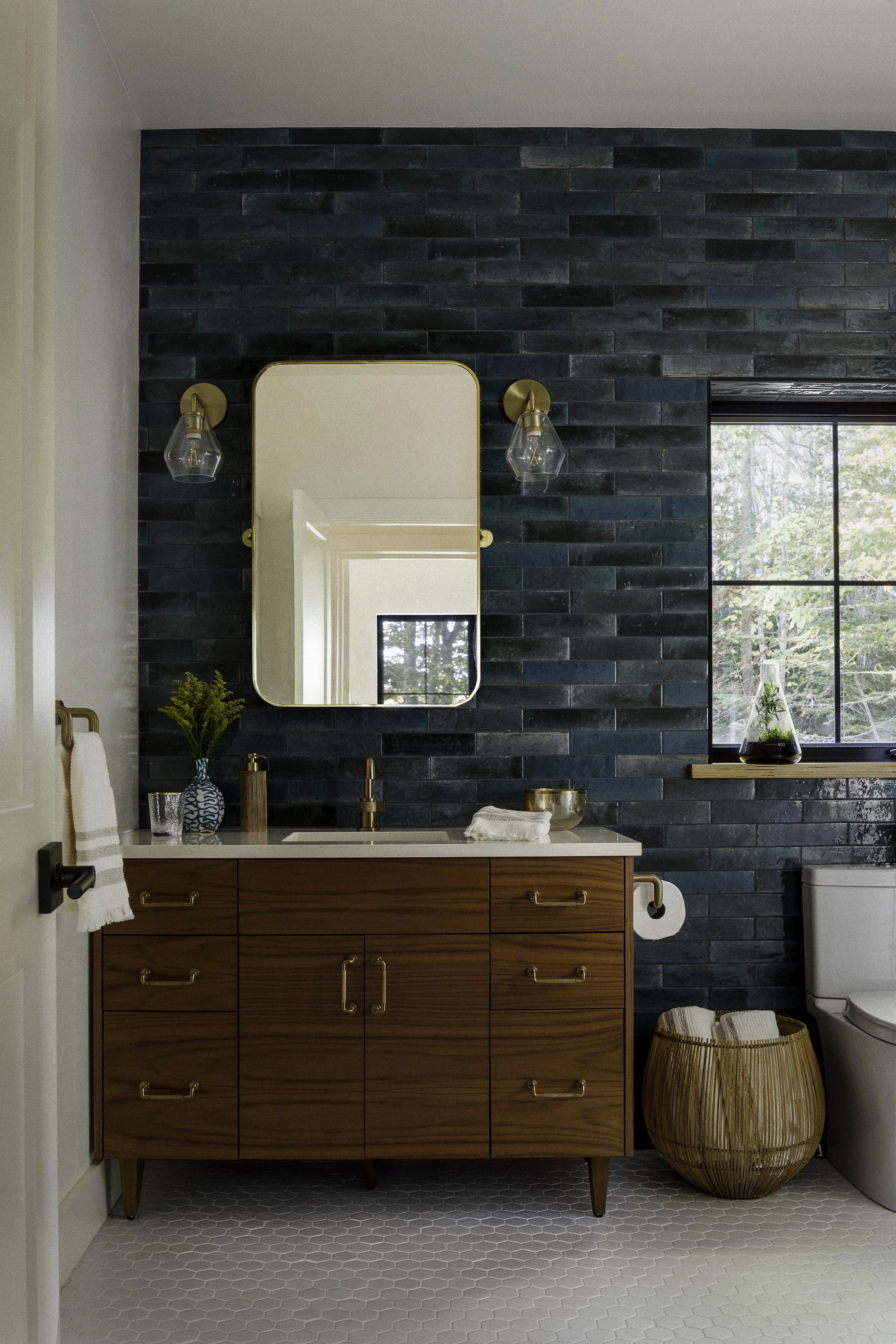
The homeowner of this BrightBuilt home selected a bold tile color scheme to invoke their design goal of bringing the outside in, reflecting the coastal views of the site
Mix it up.
Tiles come in a wide variety of shapes and sizes, so this is an area in which you can experiment with pattern and placement. Think about how you want them to be arranged: in a stack, offset, vertical or horizontal? Try laying them out in different ways and see which pattern feels and looks best in the space. To avoid venturing into “busy” territory, we recommend sticking to 2-3 variations in any given room.
Interact with samples.
Printed materials and photography are excellent resources as you begin to narrow your selections, however to get the most accurate feel for the color and texture of tile, samples are the way to go. Tiles are an expressive material and photos don’t quite convey the full story. Not to mention that every screen has different color settings, so the photos are likely to look different when you are viewing them on your phone vs your computer screen.
Prioritize functionality.
On top of the aesthetic value of tiles, it’s important to be realistic about which tiles are appropriate for which areas. Tiles are made from a variety of materials (porcelain, ceramic, terra cotta, glass, natural stone, to name just a few), so make sure to consider which options work best for shower walls, shower floors, backsplashes, etc. Ask these kind of questions: Will this tile stain? Is it slippery? Will it stand up to high volumes of foot traffic?
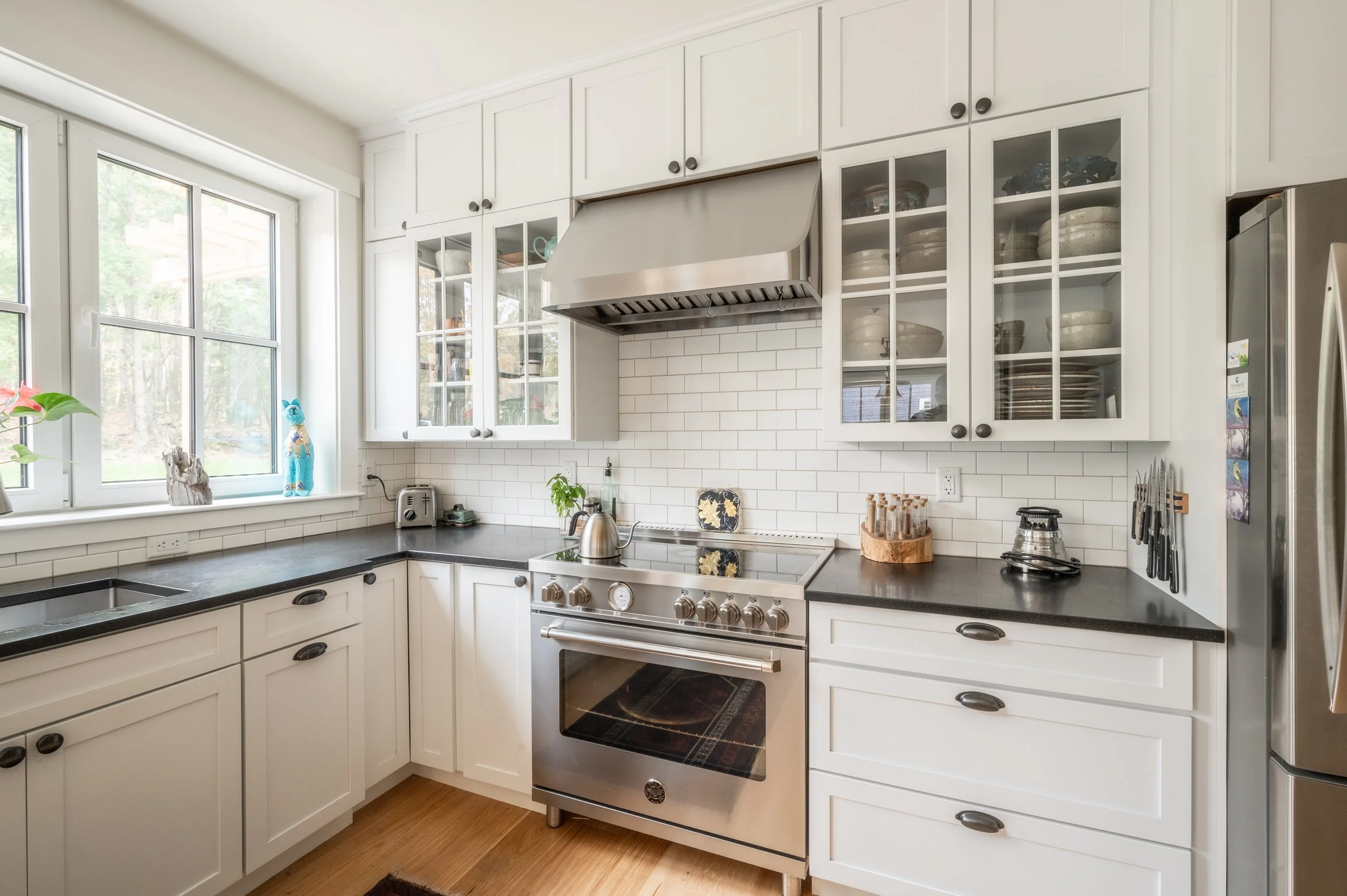
Subway tiles serve as the backsplash in this BrightBuilt Home kitchen
Pay attention to the details.
As you begin to narrow your tile choices, remember to talk to your interior designer about cost, sourcing, and sustainable options. Don’t forget to explore tile spacing and grout colors, and above all, utilize the expertise of your interior designer to make your space look incredible at the budget that works for you!